Data visualization Assignment.
I am thrilled to be back because, this time, I am taking a new class for the spring term: Visual Analytics.
I have always wanted to delve deeper into data visualization. As the class progresses, I will share my assignment on this blog.
My first assignment is as follows…
In your first blog posting describes your first visual analytics that caught your eyes in the recent weeks.
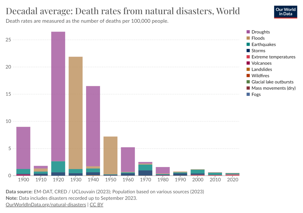
Studying now the how visualization impacts our decisions. For my first assignment I have chosen a data visualization that shows world death rates from natural disasters in decadal average Since 1900 to 2020.
The data is analyzed by country that have been affected by the following natural disasters: Droughts, Floods, Earthquakes, Storms, Extreme temperatures, Volcanoes, Landslides, Wildfires, Glacial Lake outbursts, Mass movements (dry), and Fogs. The collection of that all data exposes the deadliest natural events over the past 120 years.
As part of my ongoing study on Data Analysis, my current assignment focuses on the impact of data visualization on decision-making. Below is a compelling EM-DAT, CRED / UCLouvain (2023) visualization. (Interact in their website Our World in Data). This visualization offers insights into global mortality rates from natural disasters, calculated on a decadal average, spanning the extensive period from 1900 to 2020.
The dataset under examination has been meticulously analyzed, with a focus on countries that have grappled with a spectrum of natural misfortunes, including Droughts, Floods, Earthquakes, Storms, Extreme temperatures, Volcanoes, Landslides, Wildfires, Glacial Lake outbursts, Mass movements (dry), and Fogs.
The chosen mode of data representation is an interactive stacked column chart enriched with a ‘Play time-lapse’ feature, enabling us to observe changes over time, spanning from 1900 to 2020. The utilization of this specific chart type is deliberate; it excels in visually comparing various data sets within distinct categories or groups. This method becomes invaluable when we aim to explain the aggregate value within each category and discern how these values are apportioned across sub-categories or components.
On the chart’s horizontal axis (X-axis), we find the temporal dimension—spanning from the beginning of the 20th century to the present year. Each column signifies a year, encapsulating the decadal average of mortality rates from natural disasters. Within each column, we encounter stacks, each corresponding to a specific type of natural disaster. The height of each stack corresponds proportionally to the magnitude of the mortality rate it signifies. To the left of the chart, the Y-axis outlines the range of values, mirroring the height of the stacked columns for each category. To the right, the legend stands, attributing distinct colors to each natural disaster category, thereby enabling a straightforward interpretation of the data’s interplay.
Complementing the chart’s visual representation is a meticulously designed data table, displaying the raw data harnessed for the construction of this visualization. This supplementary element ensures transparency and allows for a comprehensive dive into the numbers underpinning our chart. Moreover, the chart is equipped with references and explanatory notes. These vital components shed light on the data’s origin and methodology and add context to our understanding.
In summary, this assignment helped me to understand the profound influence of data visualization on our capacity to get gain insight of the world around us and finally to make informed decisions. Our chosen visualizations serve as a powerful illustrations of how the data representation can shape our understanding of complex phenomena such as natural disasters’ impact on global mortality rates over time.
Reference:
EM-DAT, CRED / UCLouvain (2023); Population based on various sources (2023) – with major processing by Our World in Data. “Droughts” [dataset]. EM-DAT, CRED / UCLouvain, “Natural disasters”; Various sources, “Population” [original data].
