Hello Another great Sunday to showcase Tableau skills using qualitative and quantitative data to create visualizations and analyze data.
I have created two visualizations using test data capture from Data.gov. Here are the results.
Visualization 1 – Dual Axis Line:
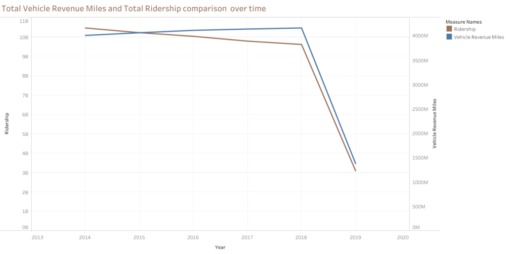
Note: for the above graph I have used ‘continuous’ instead of ‘discrete’ values. That way, I was able to provide more white space on the visualization.
The graph is a dual-axis line chart that compares Total Vehicle Revenue Miles (VRM) and Total Ridership from 2014 to approximately 2019. Here is a summary of the information depicted in the graph:
- The y-axis on the left represents Total Ridership. The y-axis on the right represents Vehicle Revenue Miles.
- The x-axis represents the years from 2013 to the start of 2020.
- The graph has two lines: Total Ridership and Vehicle Revenue Miles.
- Both lines follow a similar trend, moving mostly parallel over time.
- The total Ridership and Vehicle Revenue Miles trend was relatively flat from 2013 to around the end of 2018, indicating stable values with little to no growth or decline.
- At the very end of 2018, there was a sharp decline in Total Ridership and Vehicle Revenue Miles, where both metrics dropped significantly and continued declining into the start of 2020.
- The sharp decline could indicate an external event or change in circumstances affecting ridership and revenue miles.
The graph shows that Total Vehicle Revenue Miles and Total Ridership were stable for several years before experiencing a steep decline at the end of 2018, continuing into 2020. The graph helps visualize the trends over time, but additional context would be necessary to understand the reasons behind the dramatic changes observed in the data.
Visualization 2 – Side by Side Bars

This is another way to look at the data comparison over time and filtering by city. Adding ‘USA City’ will provide more focus data.
The graph is a side-by-side bar chart that illustrates Total Vehicle Revenue Miles (VRM) and Total Ridership by year for various cities in the United States. Here’s a summary of the key elements and observations from the chart:
- The y-axis represents the values for Total Ridership and Vehicle Revenue Miles. The x-axis categorizes the data by year, with bars representing each year from 2014 to 2019.
- The chart includes a filter list on the right side for ‘Primary USA City,’ which allows the selection of specific cities or all combined cities.
- Vehicle Revenue Miles consistently exhibit higher values than Total Ridership for all the represented years.
- The bars for both metrics remain relatively consistent across the years without any significant fluctuations or trends.
The graph compares Total Vehicle Revenue Miles and Total Ridership year over year in various U.S. cities. It shows that Vehicle Revenue Miles tend to be higher than Ridership in the given years, and the side-by-side bars facilitate a clear comparison between these two metrics. For detailed insights or to spot specific trends, please interact with the graph, possibly filtering for individual cities or examining the exact values of the bars.
