Hello again. This week, we are having fun with more visualizations.
This time we are encouraged to use R Studio to create some R graphics. Part of the project will also be reviewed by our peers, which makes it more fun.
For this assignment I have explored Kaggle datasets. They provide very useful datasets and code. Please check the work of kennystone.
The dataset includes the following variables: show_id, type, title, director, cast, country, date_added, release_year, rating, duration, listed_in, and description.
There were several simple visualizations spawning from Kenny’s dataset that I could not stop myself in using only one. Thank you, Kenny!
Here I am showing the four visualizations and the purpose of each. I will start with the simplest:
- Content Type Distribution
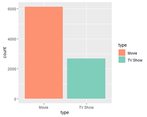
- Purpose: This visualization shows the distribution of the content types available on Netflix and compare the number of movies to TV shows.
- Method: A bar chart where each bar represents a type of content (Movie or TV Show), filled with different colors to distinguish between them.
- Analysis Potential: By examining the height of each bar, one can quickly assess which type of content is more prevalent on Netflix.
R code:
# Subset the data into separate variables
type_movie<-netflixData%>%filter(type==’Movie’)
type_tv<-netflixData%>%filter(type==’TV Show’)
#(1) contenct Type Distribution
ggplot()+
geom_bar(netflixData,mapping = aes(type,fill=type))+scale_fill_manual(values = c(“#fc9272″,”#7fcdbb” ))
2. Content Release Trends
This section contains three plots to analyze content release trends, mainly focusing on 2018 and onwards.
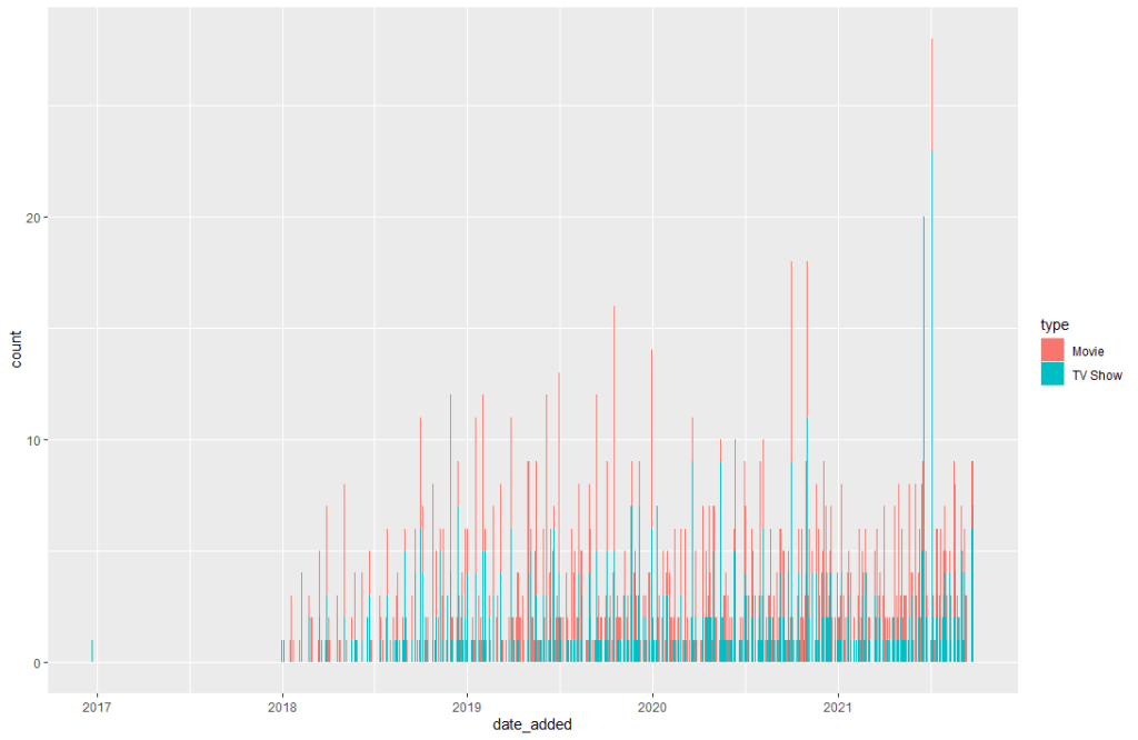
First Plot:
This plot visualizes the count of content added to Netflix over time, segmented by content type. Even though is hard to read in detail, we can still that movies numbers are higher than TV shows.
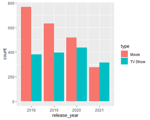
Second Plot:
This plot shows the number of movies and TV shows released each year, starting from 2018, using a dodged bar chart. This is my preferred graph to see data side by side over the years.
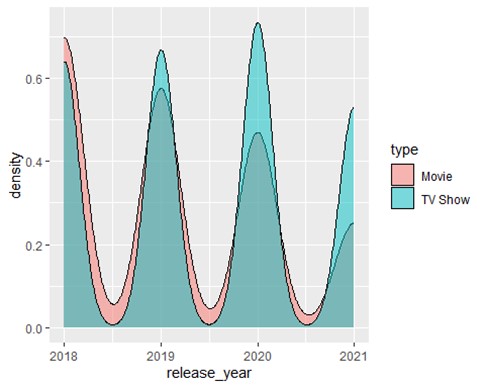
Third Plot:
This plot represents the density of movie and TV show releases over the same period, with fill indicating the type and a semi-transparent overlay for better visibility of overlaps. I feel this one is very fancy, and the values can be seen clearly even if they overlap a little bit.
- Purpose: These plots aim to analyze trends in how much content (movies and TV shows) Netflix has been adding in recent years, mainly looking for any patterns or shifts in focus between movies and TV shows.
- Analysis Potential: By reviewing these charts, one can identify trends in Netflix’s content strategy, such as an increase in original content production, shifts in focus between movies and TV shows, or years with significant content additions.
Each visualization serves a specific analytical purpose and provides a comprehensive overview of Netflix’s content strategy and catalog characteristics.
R code:
## First plot
netflixData%>%filter(release_year>’2017′)%>%ggplot()+geom_bar(mapping=aes(date_added,fill=type))
## Second plot
ggplot(netflixData_YR_2018)+geom_bar(mapping=aes(release_year,fill=type),position=’dodge’)
## Third plot
ggplot(netflixData_YR_2018)+geom_density(mapping=aes(release_year,fill=type),alpha = 0.5)
Where do all these visualizations fit according to Few’s and Yau’s discussion?
Yau’s Spotting differences
” The use of multivariate analysis to sport the differences between variables are one of the most important assets of visual analytics. Your job, according to Yau, is to find those differences and highlight them with use of visualization”
For the small data set I am using, those visualizations above highlight differences; therefore, the story on the visualizations shows that Movies have more release dates each year than TV shows based on the data analyzed.
References:
Few, S. (2021). Now you see it: Simple visualization techniques for quantitative analysis (pp. 203-230). Analytics Press.
Yau, N. (2011). Visualize this: The FlowingData guide to design, visualization, and statistics (Chapter 7, pp. 206-300). Wiley.
