My assignment for today is: ‘Create your own visual analytics based on Distribution analysis’
Using the ‘mtcars’ dataset in R, I wanted to analyze the distribution of powerful cars using histograms. To analyze the horsepower (hp) distribution of the moderate cars, as shown in the histogram, I filtered the data for cars with horsepower between 80 and 125 inclusive.
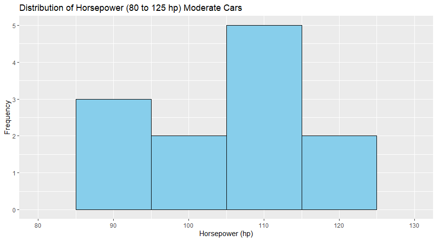
The histogram illustrates the distribution of engine horsepower for a subset of cars classified as ‘moderate‘ in terms of power. This subset includes cars with horsepower ratings between 80 and 125 hp from the ‘mtcars‘ dataset
Highlights Moderate Cars:
- The data is segmented into four bins, each representing a ten hp range, simplifying the understanding of distribution.
- Most moderate cars have horsepower ratings in the 110 to 120 hp range, as indicated by the tallest bar in the histogram.
- The frequency of cars decreases as horsepower approaches the lower end of the moderate spectrum (80 to 90 hp) and nears the upper threshold of 125 hp.
- A noticeable decline in the number of cars with horsepower between 120 to 125 hp could indicate a preference for slightly less powerful engines within the moderate category.
The histogram reveals a concentration of moderate cars within the 100 to 120 hp range, hinting at a commonality in performance preferences. The distribution shows a moderate variance, with a significant drop-off for cars with horsepower just above 120 hp.
Here is the more advanced explanation:
- There are 12 cars in the dataset that fall within the moderate horsepower range.
- The mean (average) horsepower of these cars is approximately 106.6 hp.
- The standard deviation, which measures the dispersion of the horsepower values, is about 10.8 hp.
- The minimum horsepower in this group is 91 hp, while the maximum is 123 hp.
- The median horsepower (50th percentile) is 109.5 hp, indicating that half of the cars have horsepower less than or equal to this value.
- The first quartile (25th percentile) is 96.5 hp, and the third (75th percentile) is 110.75 hp.
The histogram displays a somewhat uneven distribution, with the highest frequency in the horsepower range above 100 hp. This aligns with the median being slightly above 100 hp, indicating that many cars have horsepower around this median value. The distribution tails off for the lower and higher ends of the moderate horsepower range.
R code for the moderate cars:
# Load the necessary library
library(ggplot2)
library(dplyr)

cars <-mtcars
## moderate cars
selected_cars <- cars[cars$hp >=80 & cars$hp <=125, ]
summary(selected_cars$hp)

# Create the histogram
ggplot(selected_cars, aes(x=hp)) +
  geom_histogram( binwidth=10, fill="skyblue", color="black") +
  xlim(80, 130) +
  ggtitle("Distribution of Horsepower (80 to 125 hp) Moderate Cars") +
  xlab("Horsepower (hp)") +
  ylab("Frequency")
Now lets also work with the Powerful cars. Let’s see what else we find out from the ‘mtcars’ dataset. Here is the histogram:
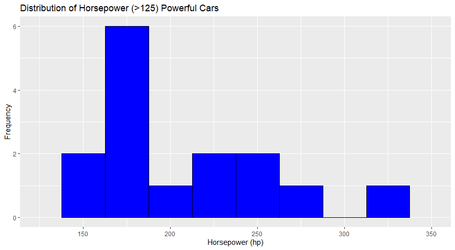
I have use ‘powerful’ on this dataset as having a horsepower greater than 125 hp from the `mtcars` dataset. I created the histogram with a bin width of 25 horsepower, and the x-axis was limited to a range of 125 to 350 horsepower. I have chosen a bin width of 25 hp, which allows for a clear differentiation between different horsepower ranges without too much granularity; it is easier to identify general trends in the data.
Here are the key findings from the histogram:
- Peak Frequency Range: The most common horsepower range among powerful cars is between 175 and 200 hp. This is where the tallest bar is located, indicating the highest frequency.
- Declining Frequency at Higher Horsepower: There is a declining frequency of cars as horsepower increases. This suggests that very high horsepower cars (over 200 hp) are less common within the powerful category.
- Spread and Distribution: The histogram shows cars distributed across several horsepower ranges but with significant variance. There are peaks around 175-200 hp and 225-250 hp ranges, with fewer cars in the highest horsepower bins (275-300 hp and 325-350 hp).
Here is the more advanced explanation:
- Fifteen cars in the dataset are classified as powerful.
- These powerful cars’ mean (average) horsepower is approximately 206.9 hp.
- The standard deviation is about 49.9 hp, indicating a fair amount of variability in the horsepower among these cars.
- The minimum horsepower in this group is 150 hp, while the maximum is 335 hp.
- The median horsepower (50th percentile) is 180 hp, meaning half of the powerful cars have horsepower less than or equal to this value.
- The first quartile (25th percentile) is at 175 hp, and the third quartile (75th percentile) is at 237.5 hp, which indicates that 25% of the powerful cars have horsepower greater than 237.5 hp.
The histogram created from the dataset shows several peaks:
- The highest frequency of cars is in the 150 to 175 hp range, which aligns with the 25th percentile.
- There’s a significant drop in frequency for cars with horsepower between 200 to 225 hp.
- Another peak is observed in the 225 to 250 hp range.
- There is a gradual decrease in frequency as horsepower increases from 250 to 350 hp, with few cars in the highest horsepower bins.
R code for the powerful cars:
###powerful cars
selected_xcars <- cars[cars$hp >125 & cars$hp <=350, ]

# Create the histogram
ggplot(selected_xcars, aes(x=hp)) +
  geom_histogram( binwidth=25, fill="blue", color="black") +
  xlim(125, 350) +
  ggtitle("Distribution of Horsepower (>125) Powerful Cars") +
  xlab("Horsepower (hp)") +
  ylab("Frequency")
summary(selected_xcars$hp)
A point on Few’s recommentations.
By analyzing these histograms, you can quickly see what horsepower ranges are most common among moderate and powerful cars. This helps you understand the characteristics of the vehicles in your dataset without having to look at each data point.
Applying Few’s recommendation were helpful.
I matched the visualizations with the dataset as closely as possible. On the visualization, there were several empty places that ggplot removed, but overall, with the correct exploring of the ‘binwidth’ and data filtering, I could maintain the data’s integrity, and the data analysis aligns with the data granularity. The histograms were skewed, but we can quickly see the horsepower commonality chosen on the dataset.
Reference:
Few, S. (2021). Now you see it: Simple visualization techniques for quantitative analysis (pp. 125-135). Analytics Press
