This week, I am happy to learn more about ggplot2. I created a correlation analysis using the Kaggle data set about Used Toyota Corolla Cars.
After analyzing the data, I found a strong linear correlation between the age and price of Toyota Corolla vehicles from the dataset. To identify the correlation coefficient, I have used the Pearson method. This will tell me the direction of the Correlation from the get-go.
Following Stephen Frew’s recommendations from Chapter 9 (Relationships among Quantitative Variables), I focused on the three key characteristics of Correlations (strength, Direction, and Shape) to find meaningful relationships with my selected dataset.
Starting on page 214 and under the subtitle “Scatter Plot Best Practices,” the recommendations helped me find the best-suited color and shapes for my scatter plot visualization. Paying attention to the correct aspect ratio shape and size helped me find the suitable scaling “to spread the values across as much space as possible” to give the pattern the best chance of being seen without too much clutter. Lastly, I have added a line to draw attention to the shape of the Correlation. That way, “we won’t rely on our eyes alone to do this, however, even when the pattern seems obvious.”
Here is the scatter plot and the summary of my correlation analysis.
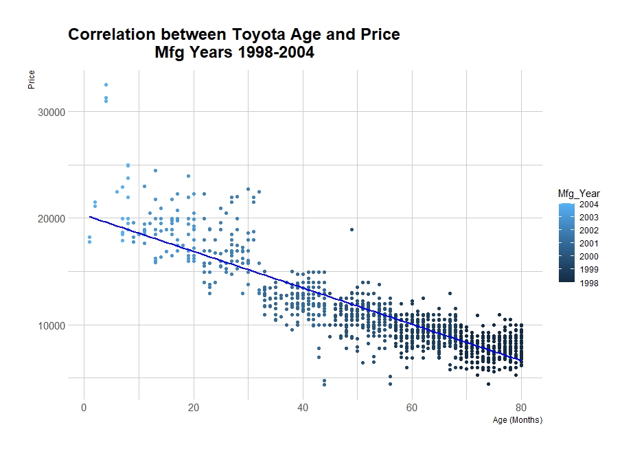
Summary of Correlation Analysis: Age and Price of Toyota Corolla Vehicles
1. Correlation Overview:
The analysis of the Toyota Corolla dataset has revealed a significant correlation between the age of the vehicles (in months) and their price. Specifically, I calculated a Pearson correlation coefficient of approximately -0.877, indicating a strong inverse relationship between these two variables.
2. Cause and Correlation:
It’s important to note that Correlation does not imply causation. While I observe a strong negative correlation between age and price, this statistical relationship does not confirm that age directly causes the price change. Multiple factors can influence a car’s price, including mileage, condition, market demand, etc. However, age can be a proxy for factors such as wear and tear, which can affect the car’s value.
3. Linearity and Strength:
- Linearity: The Correlation suggests a linear relationship, where changes in age (in months) are associated with proportional changes in price. This is supported by the scatter plot, which shows a trend that as age increases, price tends to decrease in a linear manner.
- Strength: The correlation coefficient’s magnitude (-0.877) indicates a strong relationship between age and price. This suggests that age is a significant predictor of price for Toyota Corolla vehicles in the dataset.
4. Shape and Direction:
- Shape: The linear trend observed in the scatter plot indicates a straight-line relationship, descending from left to right.
- Direction: The negative sign of the correlation coefficient indicates an inverse or negative relationship, where the price decreases as the age of the vehicle increases.
5. Gaps and Clusters:
- Gaps: The scatter plot does not explicitly show significant gaps between data points that would suggest areas of sparse data.
- Clusters: Clusters may be observed in the scatter plot, mainly grouped by model years or specific model types. These clusters can indicate that vehicles of similar age and model tend to have similar prices, but such patterns require further analysis to confirm specific groupings. Something I am looking forward todo on my next assignment.
6. Color Coding (Manufacturing Year):
The colors represent different manufacturing years for Toyota vehicles. The light-to-dark blue color gradient likely corresponds from 1998 to 2004. I have added the year manufacturing to show more context to the data; however, the spread of all manufacturing years across the range of ages suggests that the manufacturing year may not have a substantial effect on the price when accounting for the age of the vehicle.
7. Summary with Lines:
If I fit a regression line to the scatter plot, it would likely slope downward from left to right, illustrating the negative Correlation between age and price. This line would summarize the decreasing price trend with increasing age, providing a visual and quantitative summary of the linear relationship observed in the data.
This summary encapsulates the key findings and characteristics of the Correlation between age and price within the Toyota Corolla dataset, highlighting the statistical relationship’s strength, direction, and implications while noting potential variations and areas for further investigation.
Code:
library(ggplot2)
library(hrbrthemes)
# Using Pearson
correlation_age_price <- cor(toyota_data$Age_08_04, toyota_data$Price, method = "pearson")

# Scatter plot with linear trend

ggplot(toyota_data, aes(x = Age_08_04, y = Price)) +
  geom_point(aes(color = Mfg_Year)) +
  geom_smooth(method = "lm", se = FALSE, color = "blue") +
  labs(title = "Correlation between Toyota Age and Price
                  Mfg Years 1998-2004",
       x = "Age (Months)",
       y = "Price") +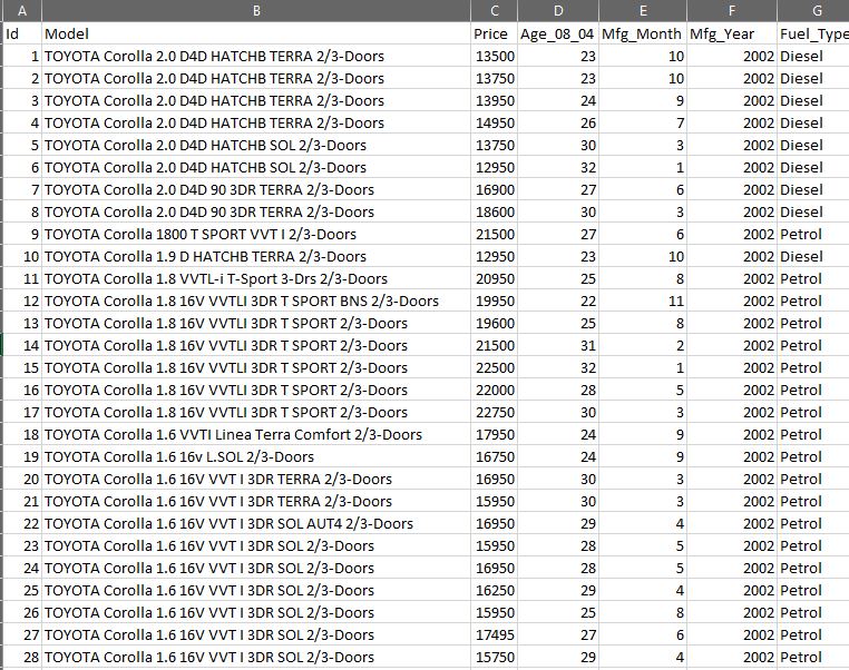
theme_ipsum()Data: I am using less columns than original dataset. Here is how the ‘toyota_data’ (from the code above) looks after modification.
Reference:
Few, S. (2021). Now you see it: Simple visualization techniques for quantitative analysis (pp. 203-230). Analytics Press.
Vishakh Dapat. (2024). Price of Used Toyota Corolla Cars [Data set]. Kaggle. https://www.kaggle.com/datasets/vishakhdapat/price-of-used-toyota-corolla-cars

One thought on “Correlation Analysis and ggplot2”