Hello again!!
This assignment analyzes time series using ggplot2 in R Studio. Its purpose is to check for data trends and pattern behavior and determine the best way to visualize them.
The time-series visualization I will be showing here depicts the Performance of different countries in a hot dog eating contest over several decades, from the early 1980s and extending to around 2010. The chart uses a bar graph format to represent the number of hot dogs eaten by the contest winners from various countries yearly.
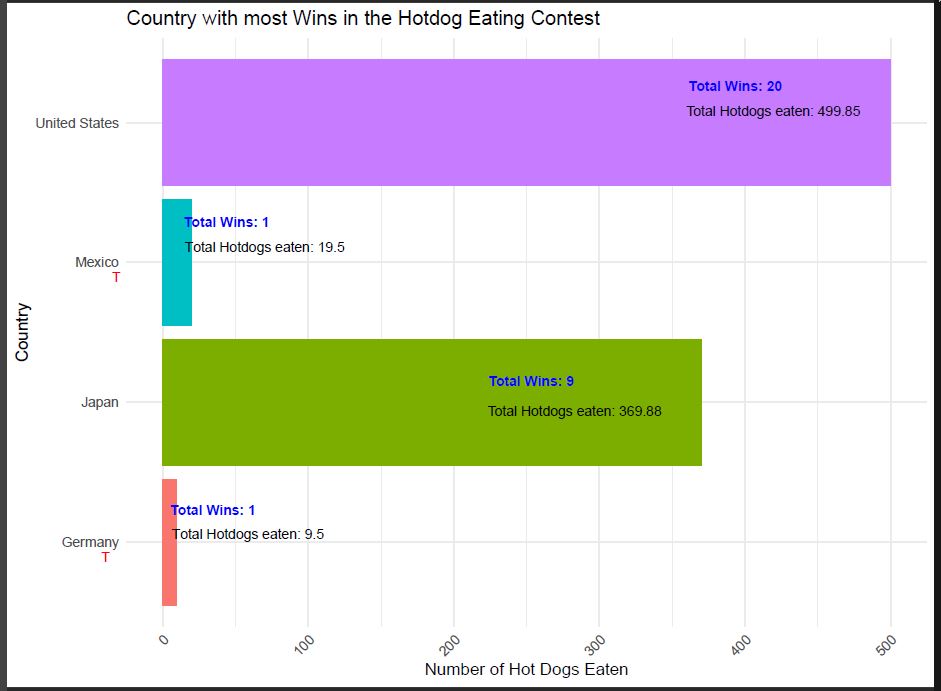
After analyzing the data, I would like to show a visualization that represents which country has had more wins over the years. That will give us a clear direction for my data storytelling. For this assignment I have also used adobe to make the labels a little bit clearer:
Now, having that in mind, let’s visualize how many times those countries that have won over time:
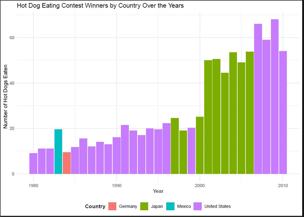
Here are the key takeaways from the visualization:
- The United States stands out as the most frequent winner, with a clear lead in the number of hot dogs eaten, especially from the late 1990s.
The number of hot dogs eaten by winners has been trending upward over the years, suggesting that the competition has become more intense or that competitors have become more skilled.
Japan appears as a significant competitor, particularly in the early 2000s, when it was either on par with or exceeded the United States in the number of hot dogs eaten.
Other countries represented on the chart, Germany and Mexico, consume much fewer hot dogs and do not show a consistent presence throughout the years. - The early 1980s started with relatively low numbers, with all countries closely matched. However, a gap quickly emerged as the United States took the lead.
- The late 2000s showed a peak in Performance, especially in the United States, which suggests either a few years of exceptional competitors or an evolution in the strategies used by participants.
Overall, the United States is the dominant country in this time series, with the most frequent and significant wins in the hot dog eating contest. It is followed by Japan, which also shows periods of high Performance. Germany and Mexico have participated but have not achieved the same level of success. The general trend of increasing the number of hot dogs eaten may reflect evolving competition dynamics, training, and interest in the contest.
Time series analysis is particularly useful for the hot dog contest data as it allows us to:
1. Observe Trends: Identify how the number of hot dogs consumed has changed. We might discover upward or downward trends, which could reflect changes in competition rules, training techniques, or competitors’ physiological limits.
2. Forecasting: Predict future Performance based on historical data. I can predict the favorite teams or, if I get more granular, the favorite contestant. On the other hand, the visualization could interest organizers, sponsors, and competitors who might use this information for training or marketing purposes.
3. Compare Performance: Look at how different countries or individuals have performed over time, which could lead to insights about competitive eating trends in other regions or the dominance of specific competitors
…..and many other insights.
In a more formal time series analysis of the hot dog contest data, I would utilize moving averages to smooth out short-term fluctuations and highlight longer-term trends or decomposition methods to understand the underlying components of the trend, seasonal, and residual terms. By combining time series analysis with other data analysis methods, such as correlation or regression analysis, I can better understand the factors influencing the number of hot dogs eaten in these contests.
##Code
library(ggplot2)
library(dplyr)

# Load the new data
hotdogdata <- '<<your folder>>/hot-dog-contest-winners.csv'
hot_dog_winners_data <- read.csv(hotdogdata)

# Sort the data by year for time series analysis
hot_dog_winners_sorted <- hot_dog_winners_data %>% arrange(Year)

# Calculate total hot dogs eaten and total wins per country
totals <- hot_dog_winners_sorted %>%
  group_by(Country) %>%
  summarize(Total_Dogs_Eaten = sum(Dogs.eaten),
            Total_Wins = n())

# Create the bar plot for countries
ggplot(data = hot_dog_winners_sorted, aes(x = Country, y = Dogs.eaten, fill = Country)) +
  geom_bar(stat = "identity") +
  labs(title = "Country with most Wins on the Hotdog Eating Contest",
       x = "Country",
       y = "Number of Hot Dogs Eaten") +
  theme_minimal() +
  theme(legend.position = "none") +
  geom_text(data = totals, aes(x = Country, y = Total_Dogs_Eaten, label = paste("Total Wins:",Total_Wins)),
            vjust = -0.5, size = 3, fontface = "bold", color = "blue") +
  geom_text(data = totals, aes(x = Country, y = Total_Dogs_Eaten, label = paste("Total Hotdogs eaten:", Total_Dogs_Eaten)),
            vjust = 2.0, size = 3, color = "red") +
  coord_flip() +
  scale_fill_discrete() +
  theme(axis.text.x = element_text(angle = 45, hjust = 1))

# Create the time series plot for the countries that participated on the contest
ggplot(data = hot_dog_winners_sorted, aes(x = Year, y = Dogs.eaten, fill = Country)) +
  geom_bar(stat = "identity") +
  labs(title = "Hot Dog Eating Contest Winners by Country Over the Years",
       x = "Year",
       y = "Number of Hot Dogs Eaten",
       fill = "Country") +
  theme_minimal() +
  theme(legend.title = element_text(face = "bold"),
        legend.position = "bottom") +
  expand_limits(y = 0)
References:
Analytics Vidhya. (2015, December 1). Complete Tutorial on Time Series Modeling. Retrieved from https://www.analyticsvidhya.com/blog/2015/12/complete-tutorial-time-series-modeling/
R Statistics. (2024.). Time Series Analysis With R. Retrieved from https://r-statistics.co/Time-Series-Analysis-With-R.html
Yau, N. (2011). Visualize this: The Flowing Data guide to design, visualization, and statistics (pp. 67-100). Wiley.
