Hello and Happy Sunday!
My assignment this week is to explore the work of Dr. Edward R. Tufte. I attempt to select one of the visualizations from Dr. Piwek’s posting on Tufte and C. Minard in R Links to an external site and see if I can generate one.
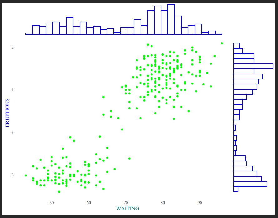
I have selected the Marginal histogram scatter plot. After installing the necessary packages, I had no issues displaying the visualization.
Marginal histograms are helpful in scenarios where we want to explore the relationship between two variables in a dataset while simultaneously examining their distributions. They are a simple but powerful way to showcase a two-dimensional visualization that includes a scatterplot of two variables and additional histograms displayed along the margins of the plot.
Here is the visualization and the code from the website:

R code:
library(ggplot2)
library(ggExtra)
library(ggthemes)
p <- ggplot(faithful, aes(waiting, eruptions)) + geom_point() + theme_tufte(ticks=F)
ggMarginal(p, type = "histogram", fill="transparent")
Visualization Highlights:
Main Scatterplot: The main part of the visualization is a scatterplot. It displays the relationship between two variables from the ‘faithful’ dataset: “waiting” (on the x-axis) and “eruptions” (on the y-axis). Each point in the scatterplot represents a combination of waiting and eruptions values for a particular observation in the dataset.
Marginal Histograms: Marginal histograms surround the scatterplot on its top and right sides. These histograms show the distribution of values for the “waiting” variable (top histogram) and the “eruptions” variable (right histogram). Each histogram consists of bars representing the frequency or count of observations falling into different bins of the respective variable.
Theme: The visualization is styled using the “Tufte” theme from the ‘ggthemes’ package. This theme is known for its minimalist design, which removes unnecessary elements like ticks, resulting in a clean and uncluttered appearance —a nod to Edward Tufte’s principles of clarity, simplicity, and effectiveness in data visualization.
Overall, this visualization provides a comprehensive view of the relationship between the two variables while also allowing for an examination of their individual distributions through the marginal histograms. It helps explore the data and identify patterns or trends.
Of course, I would like to explore and add colors. I have also used pdf to change the y-axis and x-axis font format labels. Here is the final look:
R code:
p <- ggplot(faithful, aes(waiting, eruptions)) + geom_point(color = "green") + theme_tufte(ticks=F)
ggMarginal(p, type = "histogram", fill="transparent", color = 'blue')
References:
Attali, D. (2015, March 29). ggExtra: Add marginal histograms to ggplot2, and more ggplot2 enhancements [Blog post]. Retrieved from https://deanattali.com/2015/03/29/ggExtra-r-package/
Edward Tufte: Beautiful Evidence (Highlights). (2021, May 19). [Video File]. Retrieved from https://www.youtube.com/watch?v=Th_1azZA2OY
Module # 11 Charles Joseph Minard Best Visualization according to Tufte. (2019, March 13). [Video]. YouTube. https://www.youtube.com/watch?v=ACiyMKjHuWQ
Motion in Social. (2024). Retrieved from http://motioninsocial.com/tufte/#marginal-histogram
