Hello!
For this assignment, I will learn to use animation visualization. Finding the dataset I wanted to play with was challenging. As always, I am able to find one using Kaggle. Please check it out; they have great datasets with which to practice.
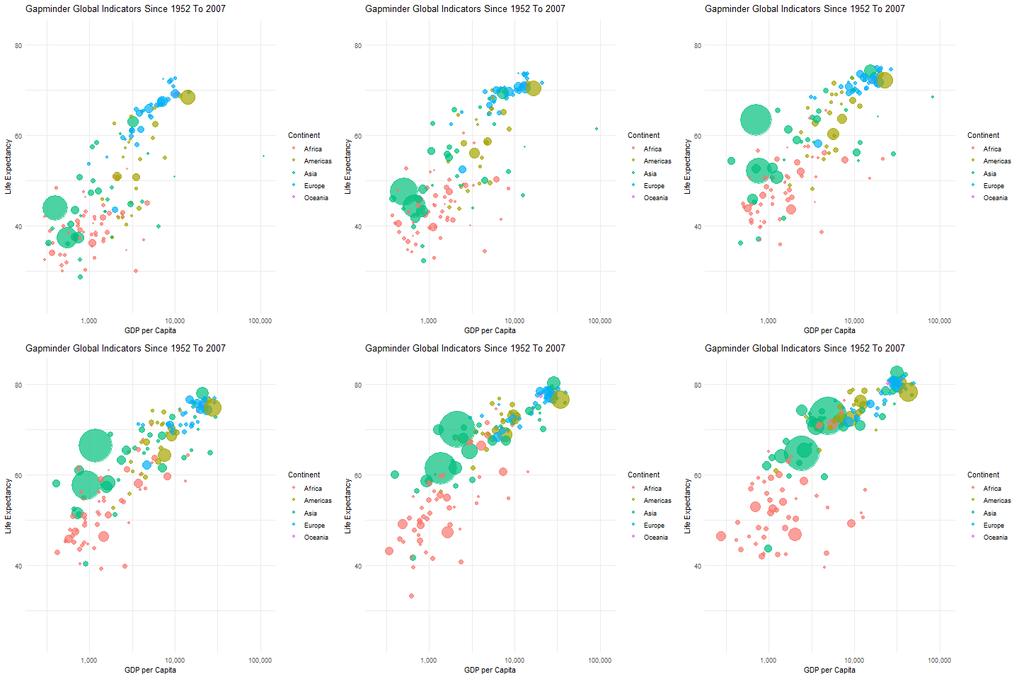
For this assignment, I will show trends where countries with higher GDP per capita have higher life expectancy. On the charts, the bubble sizes are affected by the population sizes, which vary greatly between countries.
Countries from different continents are distinctly colored, which may be a point of reference to the continental GDP and life expectancy trends.

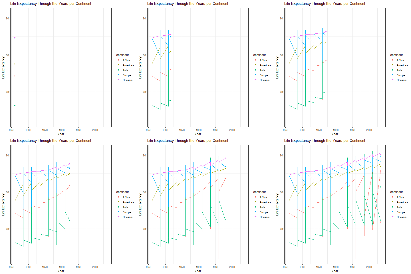
With this below animation I was able to understand the layers using ggplot2. It took more than once to get this code working.

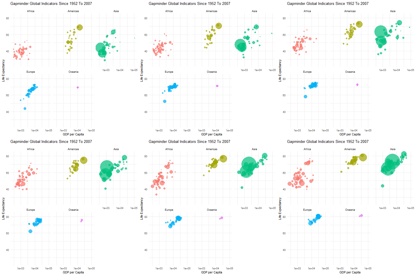
Of course, once I have gotten a handle on the data and the layers, I wanted to add another trick I learned from Dr. Bharatendra Rai’s videos on YouTube. With the visualization below, I could separate the data and visualize the animation using different panels. That way, the GPD and life expectancy can be visualized by each continent and country.

Code:
library(readr)
library(animation)
library(ggplot2)
library(gganimate)

# Load your data, NOTE: The data is from Kaggle.
gapmder_data <- read_tsv("your folder/Data Sources/gapminder.tsv")
gapminder <- data.frame(gapmder_data)

p <- ggplot(gapminder, aes(x = gdpPercap, y = lifeExp, color = continent, size = pop,  frame= year)) +
  geom_point(alpha = 0.7) +
  scale_size_continuous(range = c(1, 25), guide='none') +
  scale_color_discrete(name = "Continent")+
  scale_x_log10(labels = scales::comma_format(), breaks = c(100, 1000, 10000,100000)) +
  labs(x = "GDP per Capita", y = "Life Expectancy", title = "Gapminder Global Indicators Since 1952 To 2007") +
  theme_minimal()+
  transition_time(year)

p

# Save as GIF
anim_save("Gapminder_Animation.gif", animate(p, nframes = 100))

# Tryin using facet_wrap

p1 <- ggplot(gapminder, aes(x = gdpPercap, y = lifeExp, color = continent, size = pop)) +
  geom_point(show.legend =F,alpha = 0.7) +
  scale_size_continuous(range = c(1, 25), guide='none') +
  scale_x_log10() +
  labs(x = "GDP per Capita", y = "Life Expectancy", title = "Gapminder Global Indicators Since 1952 To 2007") +
  theme_minimal()+
  transition_time(year) +
  facet_wrap(~continent)
p1
#saving as gif
anim_save("Gapminder_Animation_continents.gif", animate(p1, nframes = 100))

# Data
r <- ggplot(gapminder,
            aes(x = year, y = lifeExp,
                group = continent, color= continent)) +
  geom_line()+
  geom_point() +
  theme_bw()+
  labs(x = 'Year',
       y = 'Life Expectancy') +
  ggtitle("Life Expectancy Through the Years per Continent")+
transition_reveal(year)
r
#saving as gif
anim_save("Gapminder_Animation_Anotherview.gif", animate(r, nframes = 100)) References:
Bharatendra, R. Dr. (2024).Animated Line Plot with R #2. Retrieved from https://www.youtube.com/watch?v=0xsM0MbRPGE&t=893s
Keserwani, A . (2024). Guide to Animated Bubble Charts using Plotly. Kaggle.https://www.kaggle.com/code/aashita/guide-to-animated-bubble-charts-using-plotly
Xie, Y.(2013). animation: An R Package for Creating Animations and Demonstrating Statistical Methods. Journal of Statistical Software,53(1)