Hello again! This week, we are exploring Data Frames in R.
According to The Art of R Programming (Matloff, p. 35),
“A data frame in R is a list, with each component of the list being a vector corresponding to a column in our ‘matrix’ of data.”
What is a Data Frame?
A matrix is a rectangular array of numbers, but what if our dataset contains something other than numbers?
Our textbook states that:
“A typical data set contains data of different modes.”
Data frames allow us to store numbers and text, making them highly useful for datasets and analysis. Unlike matrices, data frames can have column labels, making them an excellent choice for structured data—just like a Google Sheet or an Excel Table.
Creating a Data Frame in R
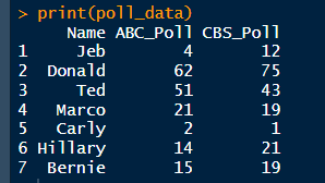
For this week’s module, we were given the following made-up dataset to construct a data frame in R:
> Name <- c(“Jeb”, “Donald”, “Ted”, “Marco” “Carly”, “Hillary”, “Berine”)
> ABC political poll results <- c(4, 62 51, 21, 2, 14, 15)
> CBS political poll results <- c(12, 75, 43, 19, 1, 21, 19)
💡 Note: I have slightly modified the dataset label names. See my full code on GitHub.
This small dataset is excellent for analyzing political polls and provides a glimpse into real-world data analysis.
Accessing Data from the Data Frame
After creating the data frame, we can extract and analyze specific data portions.
Viewing ABC Political Poll Results
📌 Output:
[1] 4 62 51 21 2 14 15
Viewing CBS Political Poll Results
📌 Output:
[1] 12 75 43 19 1 21 19
Extracting a Candidate’s Poll Data
To retrieve Jeb’s poll results:
📌 Output:
Name ABC_Poll CBS_Poll
1 Jeb 4 12
Extracting Only Poll Numbers
If we want to ignore candidate names and focus only on poll numbers:
📌 Output:
ABC_Poll CBS_Poll
1 4 12
2 62 75
3 51 43
4 21 19
5 2 1
6 14 21
7 15 19
📊 Data Visualization: Bringing Poll Data to Life
While working with raw numbers is helpful, visualization is the best way to understand trends.
Here’s a bar plot comparing the ABC and CBS poll results:
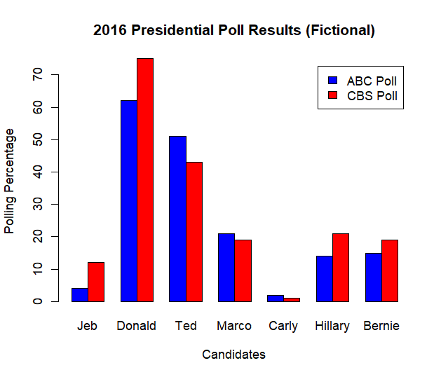
Interpretation:
- The blue bars represent ABC poll results, and the red bars represent CBS poll results.
- The height of each bar corresponds to the percentage of support each candidate received.
- Donald Trump has the highest support in both polls.
- The differences between ABC and CBS results may indicate polling bias or methodological differences.
Conclusion
In this exercise, we demonstrated how to: - Store election poll data in R using a data frame.
- Compute summary statistics to understand polling trends.
- Visualize poll results using a bar chart.
- Identify discrepancies between polling sources.
These techniques are fundamental in political analysis, market research, and social science studies, where polling data is frequently used to infer public opinion trends.
References
📖 Matloff, N. (2011). The Art of R Programming: A Tour of Statistical Software Design. No Starch Press. ISBN 10: 1-59327-384-3, Pages 35-36.
Final Notes:
Data frames allow us to do so much more, and I find them incredibly useful—especially when working with fun datasets like this! 😃
