Lessons from Module 4
This module was all about structured programming in R, and honestly, it made life easier. Instead of messy, repetitive code, we used functions to simplify our workflow, making everything clean, reusable, and scalable. The case study? A hospital dataset where we analyzed blood pressure (BP) readings and doctor assessments.
Here’s what I will cover:
- Why structured programming is a game-changer in R.
- Cleaning and processing the hospital data.
- What I learned from BP distributions and doctor ratings.
- Insights from visualizations.
Why Structured Programming Matters?
Using functions in R:
- Keeps code neat and organized ✅
- Eliminates unnecessary repetition ✅
- Makes debugging a breeze ✅
- Works for small and large datasets alike ✅
This isn’t just for school assignments—it’s real-world coding best practice.
Instead of manually handling every step, I have created functions for data cleaning, handling missing values, and visualization, making the code adaptable and efficient.
Data Wrangling: Cleaning Up the Hospital Data
💡 Note: Please see my complete code on GitHub.
The dataset included 10 hospital patients and these key variables:
- Frequency of hospital visits (Freq)
- Blood pressure (bloodp)
- First doctor’s assessment (First): bad = 1, good = 0
- Second doctor’s assessment (Second): low = 0, high = 1
- Final decision from emergency unit (FinalDecision): low = 0, high = 1
Processing the data
I have built two functions to:
- Convert categorical values to numeric (bad/good, low/high → 1/0)
- Handle missing values using multiple imputations.
- Automate these steps, making the script ready for any dataset.
Instead of handling these changes manually, our functions did all the work—a big win for efficiency.
Here are the before and after the data cleansing:

Data Visualization: Spotting Patterns in BP & Doctor’s Ratings
To explore BP trends, I created:
✅ A boxplot comparing BP based on First Doctor’s Assessment
✅ A histogram showing the overall BP distribution
📊 Boxplot Analysis: BP of First Doctor’s Assessment

Key Insights:
- Higher BP doesn’t always mean a ‘bad’ assessment
- Some high BP patients were rated ‘good,’ meaning doctors likely considered other health factors.
- The spread of BP is wide in both categories, showing no strict BP cutoff for a ‘bad’ rating.
- Outliers exist in both groups
- Some low BP patients were rated ‘bad’, proving BP isn’t the only thing doctors look at.
📊 Histogram Analysis: BP Distribution
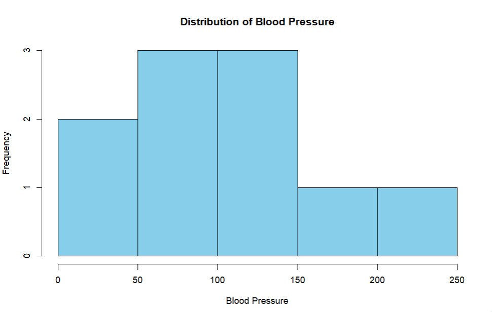
Key Insights:
- BP values are all over the place, ranging from 32 to 205.
- Most patients fall between 50-150 BP, but there are some clear high BP cases.
- No clear BP threshold for severity, reinforcing the idea that doctors use multiple factors for decisions.
Final Thoughts 💡
This module made one thing clear: structured programming saves time and effort. Writing functions meant I didn’t have to repeat tasks manually, and the analysis was cleaner, more scalable, and easy to extend. This approach will work for this project and any future dataset.
📂 Check out my full code on GitHub!
💬 Have you used structured programming in R before? Let’s talk! 😊
